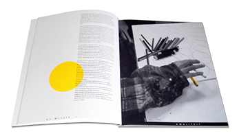
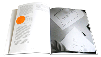
During the drawing sessions a photographer kept track of the activities.
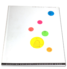
I selected about 35 drawings I considered to be most representive for the subjects per chapter, those were printed on round stickers of different sizes in fluorescent colours. The covers of the report, according to a deceively simple design that left a lot of space for 'additional creativity', were preprinted. The clients distributed six different stickers-with-drawings at their own discretion over the cover. While doing this they were photographed again.
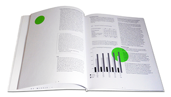
The fluorescent circles were also used in the interior of the report. They were placed over and around the text, in the same 'random' way as the stickers were put on the cover.
A selection of the black & white photographs made during the drawing and final composition of the cover, illustrate the openingpage of each chapter. My finishing touch was to highlight one small element (e.g. a pencil, a sticker) in every picture with the colour of the chapter.
The Daelzicht Foundation runs two institutions where mentally handicapped people (the clients) live and work. I was commissioned to design the annual report.
My basic idea for the design was to involve the clients in the design and production of a publication about the welfare of their own home and work.
The clients could hardly be expected to contribute in a conceptual way, so I came up with a artistically and socially creative compromise. Groups of clients were asked to improvise drawings about the themes covered by the report, like Quality, Finance, Client support, Personnel, Organization, etc.